How to Write a Crowdfunding Page That Actually Converts Visitors Into Backers
Apr 19, 2026

Most crowdfunding pages do not fail because the product is bad. They fail because the page does not do its job.
A campaign page is not a place to dump every feature, every spec, and every reason you personally love what you built. It is a sales page. Its one job is to take someone who has never heard of you, show them something they did not know they needed, and get them to hand over money for a product that does not exist yet.
That is genuinely hard to do. And most first-time creators underestimate just how hard it is until they are watching their campaign stall in real time.
This guide walks through how to write a campaign page that actually converts, section by section, in plain language.
Understand Who You Are Writing For Before You Write Anything
The most common mistake on crowdfunding pages is writing for everyone. Pages that try to speak to everyone end up connecting with nobody.
Before you write a single word, get very specific about who your backer is. Not in a vague demographic sense like "adults aged 25 to 45 who like technology." In a real, human sense. What does this person care about? What problem are they dealing with that your product solves? What have they tried before that did not work? What would make them feel skeptical about a crowdfunding campaign for this kind of product?
When you write with one specific person in mind, your copy becomes sharper, more direct, and more persuasive. People reading it feel like you are talking to them personally rather than broadcasting to a crowd.
Write that person down before you start. Keep them in mind for every section of the page.
The Hook Has About Three Seconds to Work
When someone lands on your campaign page, they make a snap judgment almost immediately. If the first thing they see does not grab them, they leave. Most of them do not come back.
Your hook is the combination of your campaign title, your short description, and your hero image or video thumbnail. These three things are what someone sees before they scroll, before they watch your video, before they read anything else.
Your title should be clear and specific. It should tell someone exactly what the product is and hint at why it matters. Avoid clever wordplay that makes people think. Clever is the enemy of clear on a campaign page.
Your short description should expand on the title in one or two sentences. What does this product do? Who is it for? Why should someone care right now?
Your hero image should show the product in use, in a real context that your target backer recognizes and connects with. Not a render floating in white space. Not a close-up of a component. The product is being used by a real person in a real situation.
If someone reads your title, skims your description, and glances at your hero image and still does not understand what you are selling and why it matters, the rest of the page does not get a chance.
Your Video Is the Most Important Asset on the Page
Kickstarter's own data shows consistently that campaigns with videos raise more money than campaigns without them. A lot more. Your video is not optional if you are serious about your campaign.
But not just any video. A campaign video that converts does a few specific things.
It opens with the problem, not the product. Show your backer feeling the frustration or the gap that your product fills before you show them the solution. If someone feels seen in the first ten seconds of your video, they will keep watching.
It introduces the product clearly and shows it actually working. Not a concept render. Not a promise. The product does the thing it is supposed to do, in a way that makes the benefit obvious.
It introduces you, the creator, briefly and honestly. People back people, not just products. You do not need to be charismatic or polished. You need to be real. A quick moment where you explain why you built this thing and why you care about it adds more trust than any amount of professional production value.
It ends with a clear call to action. Tell people to back the campaign. Tell them what they get when they do. Do not assume they will figure it out.
Keep it under three minutes if you can. Two minutes is better. The drop-off rate on crowdfunding videos goes up sharply after the two-minute mark.
Lead With the Problem, Not the Product
This applies to your video and to the written sections of your page.
Most creators want to talk about their product immediately because they are excited about it, and they have been living with it for months or years. That is completely understandable. It is also the wrong instinct for a campaign page.
Your backer does not care about your product yet. They care about their own life and their own problems. The way you get them to care about your product is by first making them feel understood.
Start with the problem. Describe it in enough detail that someone who experiences it thinks "yes, exactly, that is exactly what it is like." Make them feel the frustration, the gap, or the inconvenience before you offer the solution.
Then introduce your product as the answer. The shift from problem to solution is where the emotional hook happens. Done well, it makes the product feel inevitable rather than optional.
Explain the Product Clearly and Simply
Once you have established the problem and introduced your product as the solution, you need to explain what it actually is and how it works.
This is where a lot of creators go wrong in a different direction. They either get too technical, burying the reader in specs and features that mean nothing without context, or they stay too vague, using words like "innovative" and "revolutionary" that communicate nothing at all.
Explain your product the way you would explain it to a smart friend who knows nothing about your category. What does it do? How does it do it? What makes it different from what already exists?
Use images and short captions alongside your written explanations. People do not read long blocks of text on campaign pages. They scan. Your images and captions need to carry most of the communication load, with the written sections adding depth for people who want it.
Features are fine to list, but always connect them to benefits. A feature is what the product has. A benefit is what it means for the person using it. "Waterproof up to 30 meters" is a feature. "Take it in the pool, in the rain, or on the water without a second thought" is a benefit. Benefits are what people actually respond to.
Social Proof Matters More Than You Think
If someone has never heard of you and you are asking them to pay upfront for something that does not exist yet, they are taking a risk. Social proof is what reduces that risk enough for them to act.
Social proof on a campaign page can take several forms. Press coverage from recognizable publications is powerful if you have it. Quotes from real people who have tested the product work well. The number of backers you already have matters, which is why the first 48 hours of a campaign are so important. Expert endorsements, relevant certifications, or notable partnerships all help.
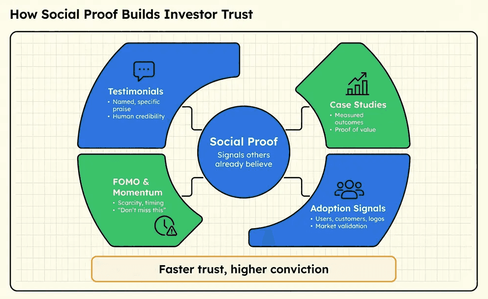
If you are launching without much social proof yet, be honest about it and lean into the story of why you built this instead. Authenticity is its own kind of social proof. A creator who is clearly real, clearly passionate, and clearly competent can earn trust even without a wall of press logos.
What kills trust faster than anything else is vague claims, obvious hype language, and renders that look too perfect. Backers have seen enough campaigns to be cynical. Treat them like intelligent adults, and they will respond accordingly.
Your Reward Tiers Are Part of the Page
How you structure and present your reward tiers has a direct impact on your conversion rate, and most creators think about this too late or too casually.
Your tiers should be easy to understand at a glance. If someone has to read carefully to figure out what they are getting, you will lose them.
Your early bird tier should create genuine urgency without feeling manipulative. A limited quantity at a meaningful discount works. An artificial countdown timer on a tier that never actually runs out does not work and actively damages trust.
Your main tier is the one most backers will pick, so it needs to be your clearest offer at your best sustainable price. Make sure the value is obvious, and the description is simple.
Limit the number of tiers. Four to six is usually enough. More than that creates decision fatigue and can actually reduce conversion rates.
End With a Clear and Specific Call to Action
A lot of campaign pages just trail off. They finish explaining the product, list the tiers, and then stop. That is a missed opportunity.
End your page with a direct ask. Tell people to back the campaign. Remind them briefly why it matters, what they get, and when they will get it. Give them a reason to act now rather than saving it for later, because later almost never happens on crowdfunding campaigns.
A simple, direct closing statement is more effective than a long emotional appeal. Something that reminds them of the core promise, thanks them for reading, and points clearly to the back button.
Read Your Page Like a Skeptic
Once you have written a draft, read it back with the most skeptical possible version of your target backer in mind.
Where would they roll their eyes? Where would they feel confused? Where would they feel like they were being sold to in a way that puts them off? Where does the page fail to answer an obvious question they would have?
Better yet, find real people who match your target customer profile and ask them to read it. Watch where they slow down, where they scroll past quickly, and where they stop. Do not ask them what they think. Ask them what questions they still have after reading it.
The gap between the questions they still have and the answers your page provides is exactly where your next round of edits needs to happen.
A Great Page Is Not Enough On Its Own
Writing a campaign page that converts is one of the most important things you can do for your campaign. But it works within a system. If nobody sees the page, it does not matter how good it is. If your pre-launch audience is not warm, even a great page will underperform.
The page is the closer. Everything else you do before and during the campaign is what gets people to it in a position to be convinced.
Get the page right. And then make sure you are doing everything else right alongside it.
If you want a second set of eyes on your campaign page before it goes live, or help building the strategy that surrounds it, SVBY has helped campaigns raise over $50,000 on Kickstarter by getting exactly these details right. Book a free 30-minute call, and let's take a look at what you have.


